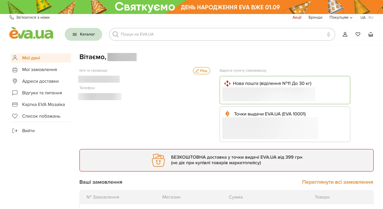
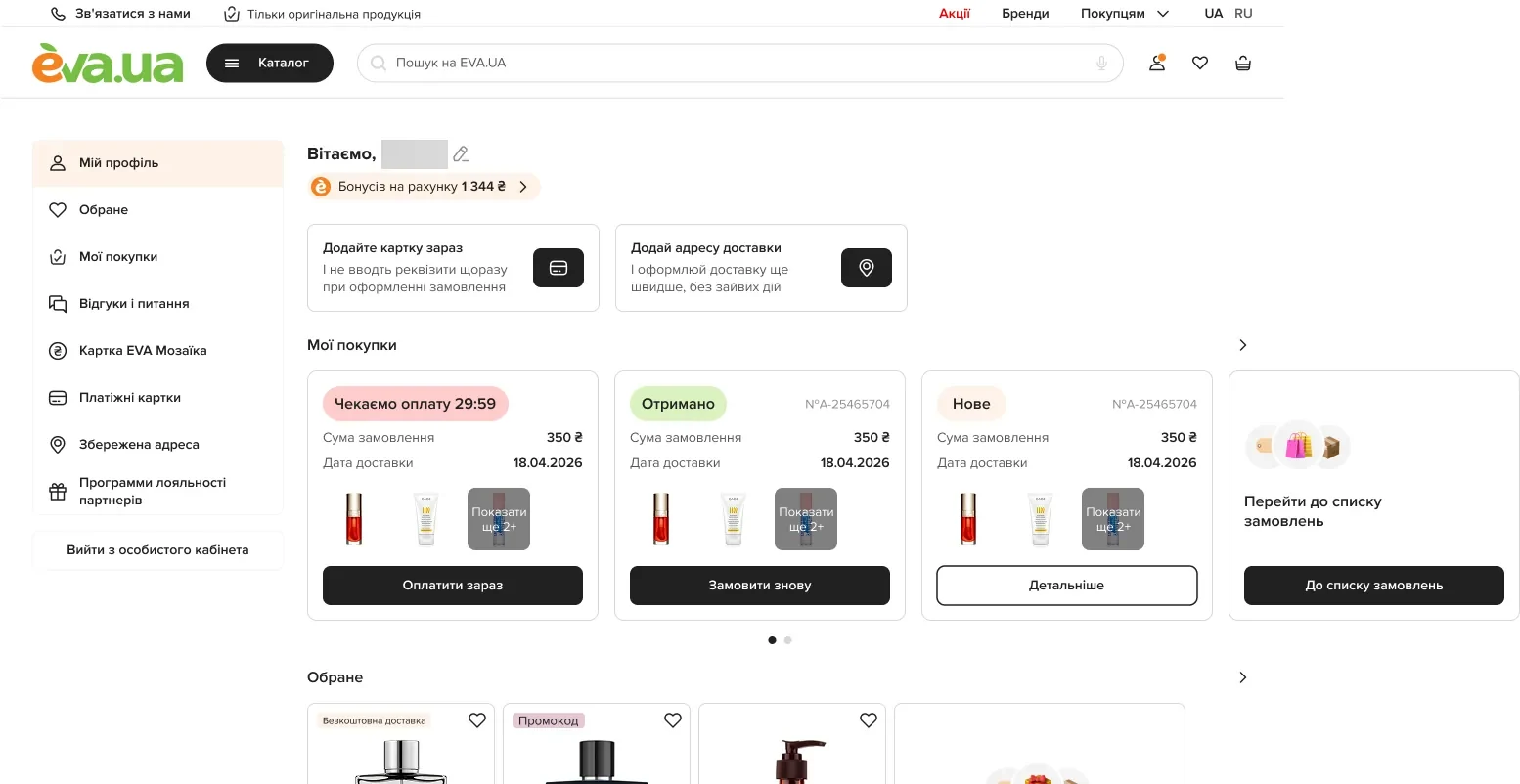
Before
+38%revenue per session
The problem
The account is where people come back after buying: their orders, bonuses, saved cards and addresses.
The old one opened on a form and a table.
What changed
-
Orders became cards with their next step
Before, a table with a status line in each row. Now each order is a card with its status (“Awaiting payment 29:59”, “Received”, “New”), the total, the delivery date and one action: “Pay now”, “Order again” or “Details”.
Each order says what it needs from you.
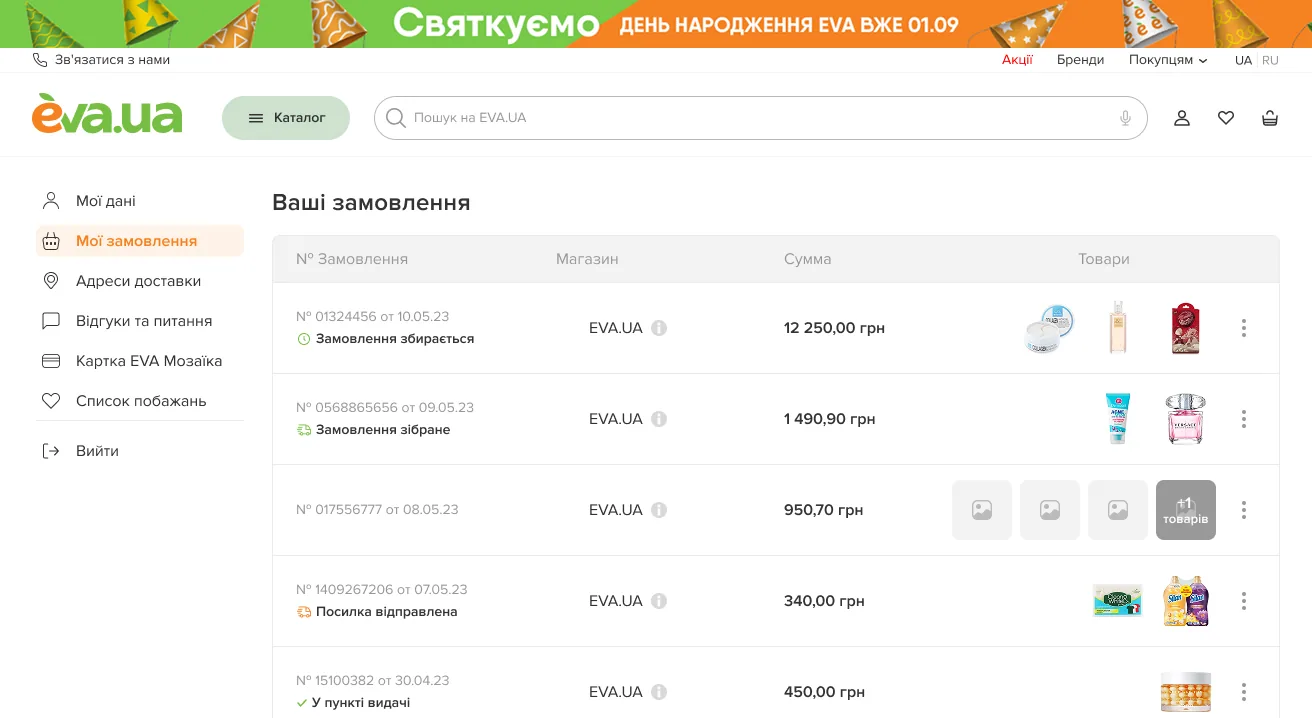
Before: a table, a status in each row 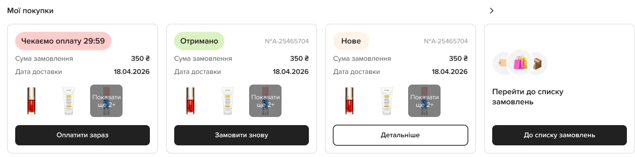
After: a card per order, its status and its one next step -
The dashboard asks for what saves time
The bonus balance at the top; two prompts, to add a card and a delivery address, each with its reason: “And don’t enter your details every time you order”.
The account earns its place by making the next order faster.

The bonus balance, then two prompts with their reasons -
One order, one page
A new order page: status and date, “Order again” and “Manage order”, the items with “Leave a review” and “To cart”, and the summary.
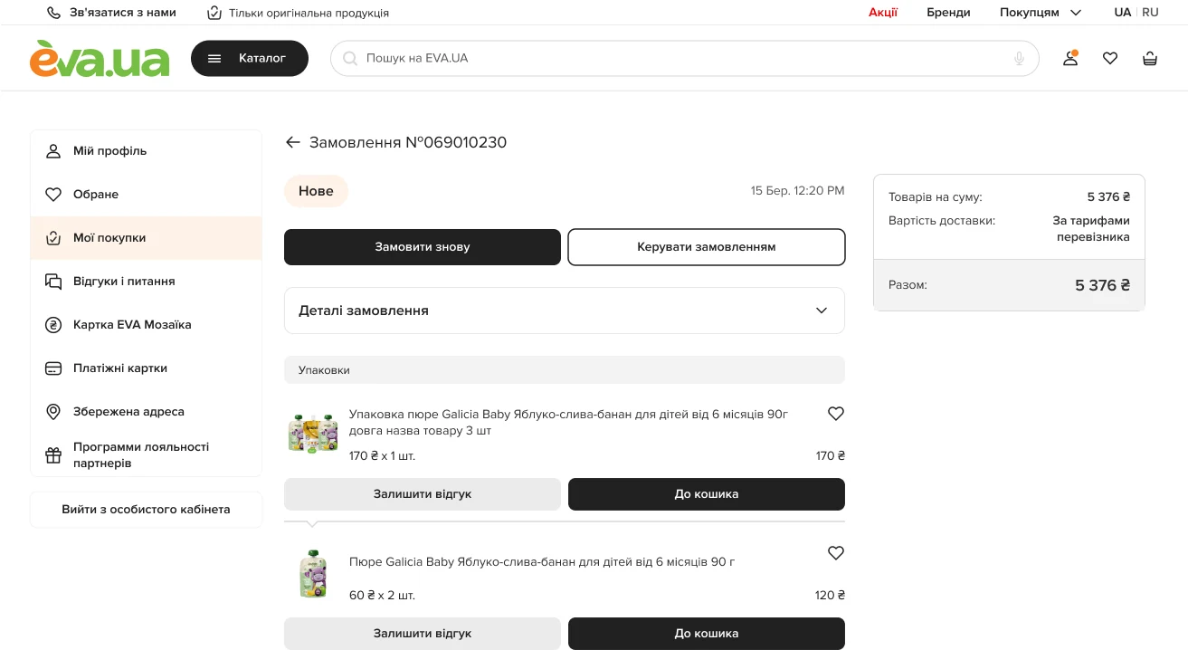
The order: status, two actions, items, summary
How it was proved
A/B test, new against old
- Revenue per session
- +38%
- Repeat orders
- +92%
- Purchases
- +14%
- Add to cart
- +6%
- Going to the wishlist
- +4%