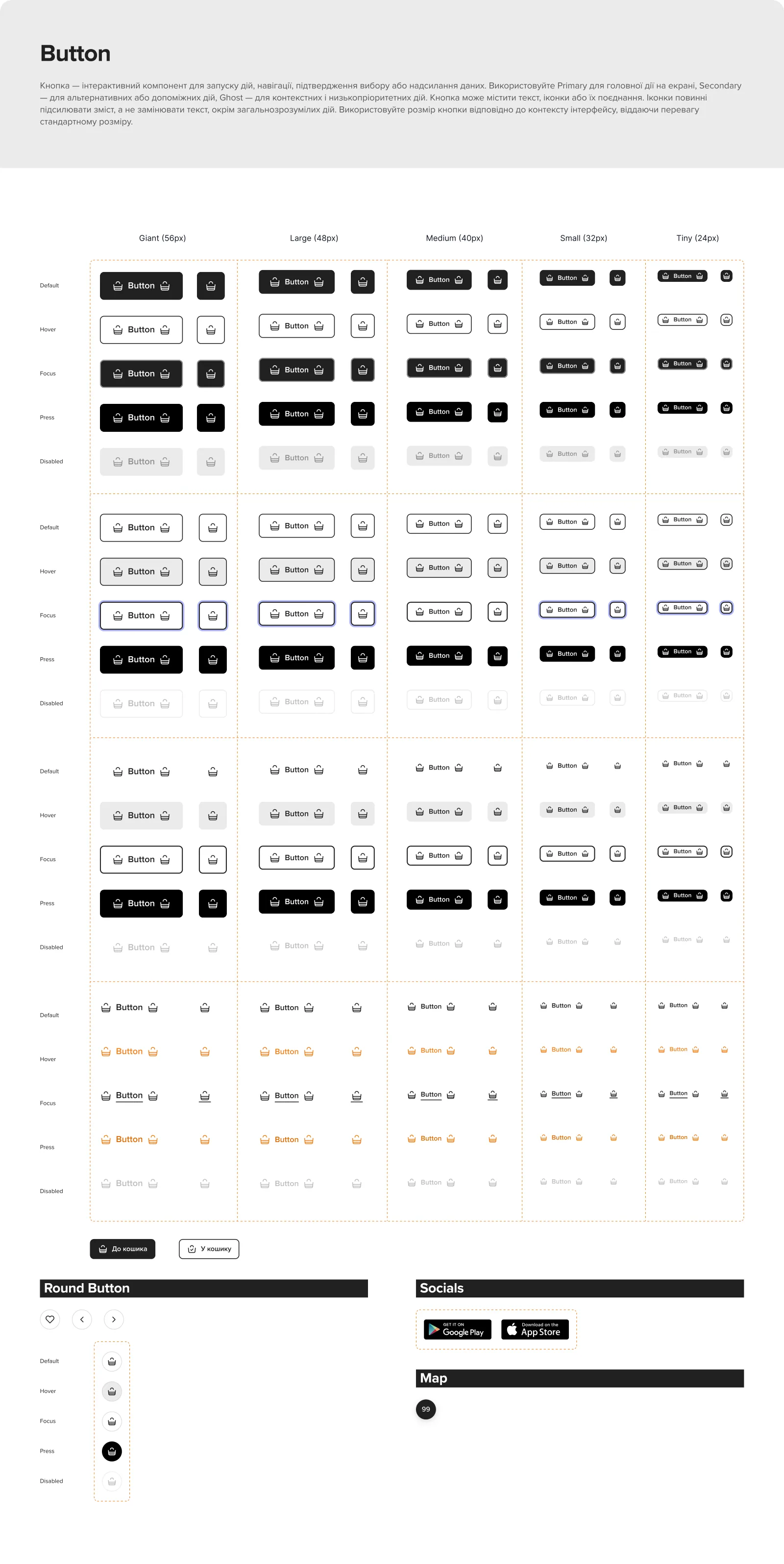
The button page
Minutesfrom a Figma change to production, not days
The problem
Before, recolouring a button meant hunting for every button on the site and handing mockups to a developer.
What changed
-
One library, shared with development
I built EVA Library WEB and connected it to the library our developers use, so a change in Figma reaches production.
-
Every component with its states
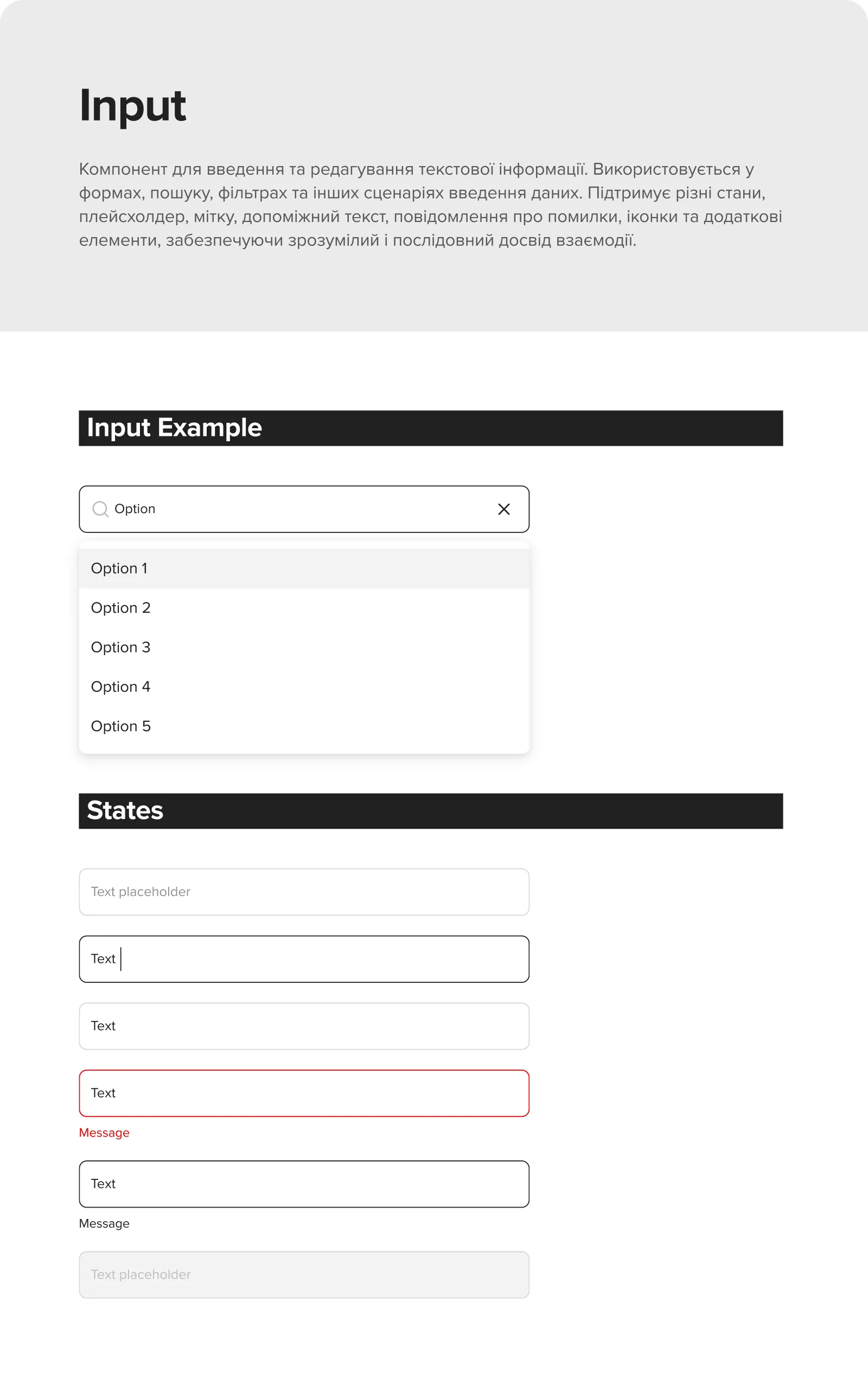
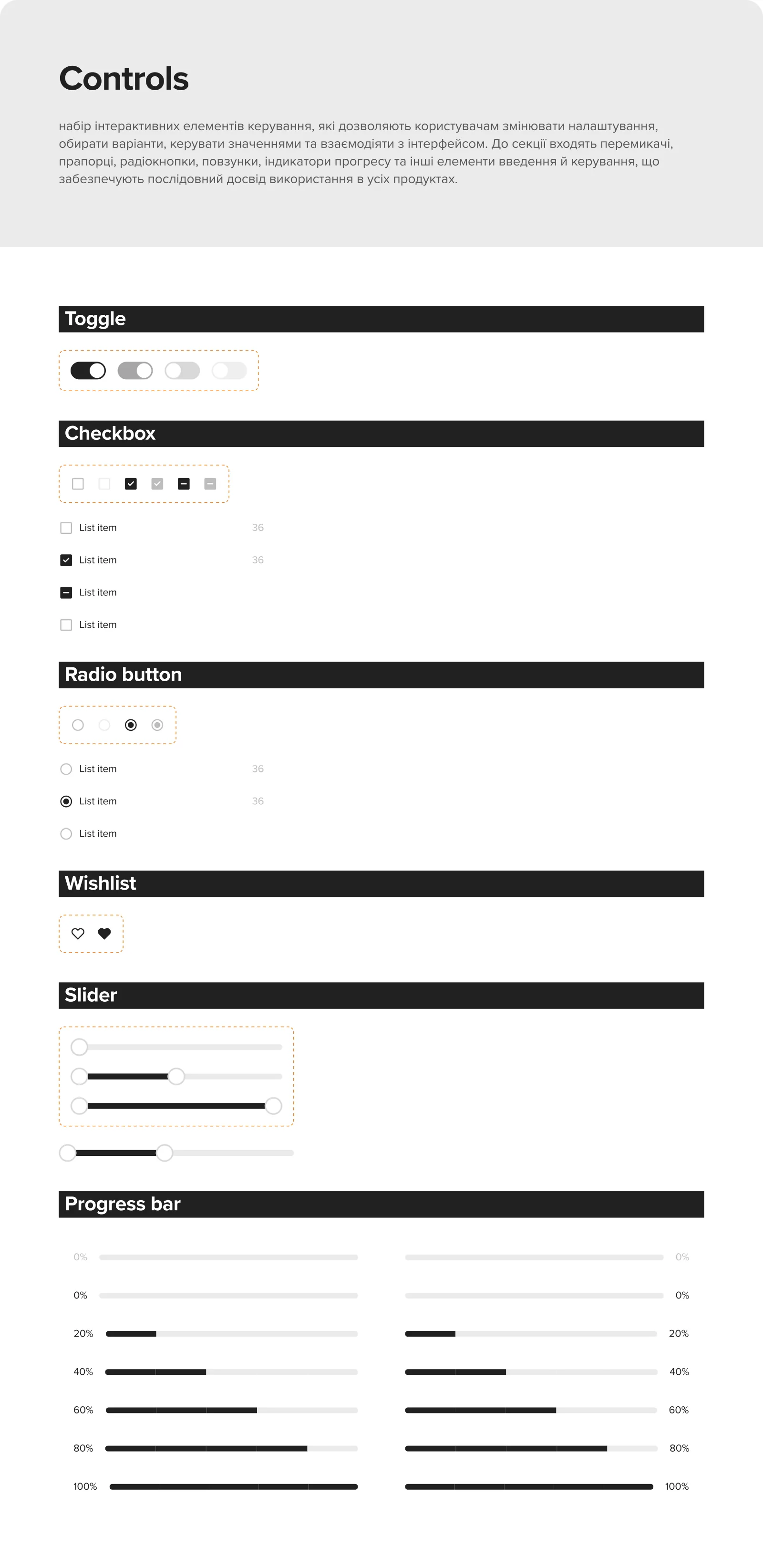
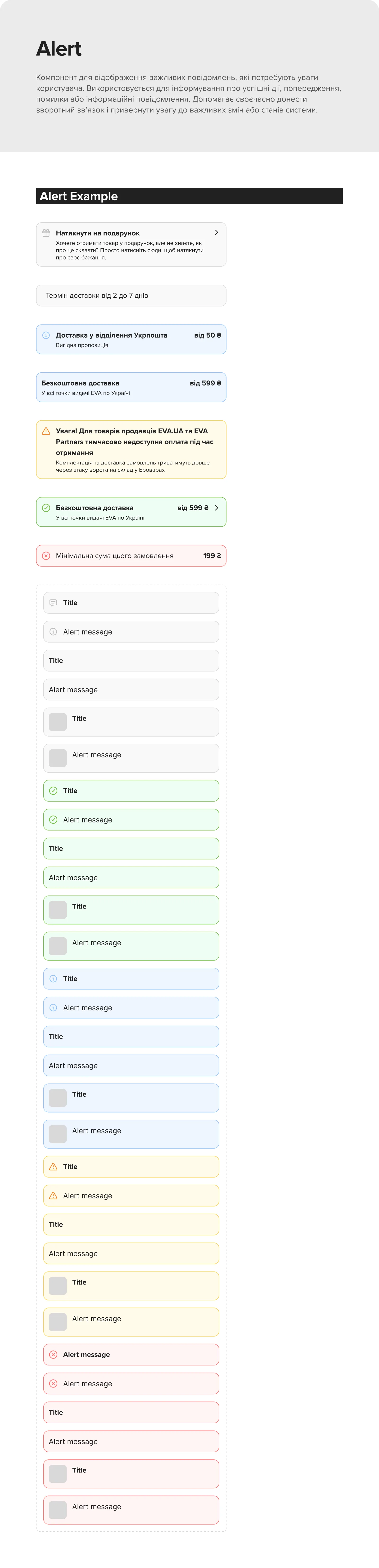
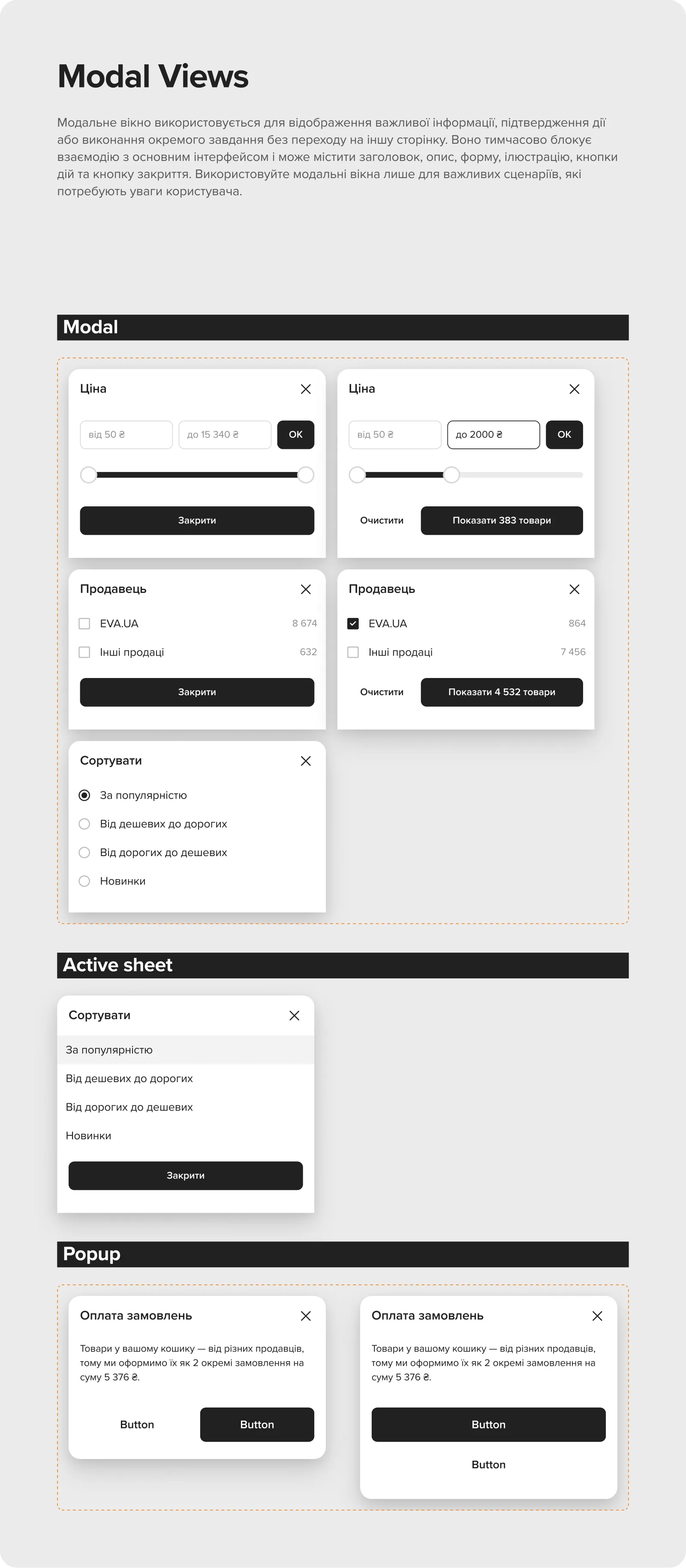
Buttons in five sizes and five states (default, hover, focus, pressed, disabled); inputs with focus, error and disabled; alerts in five colours. It also holds templates, desktop and mobile headers with seasonal variants, the footer, modals and the bottom sheet.
-
Type as roles, not sizes
Display, title, body, label, overline and caption styles, each tied to a token, with written rules for when to use which.
-
What is live, and what is not
Every page in the file carries a status, Prod, Concept or In process, and every component its notes on when to use it and how it behaves.
States
How it was proved
- From a Figma change to production
- Before, days; now, minutes or seconds.