

Before the update
+3%conversion after the update
The problem
A checkout on eva.ua has a lot to hold: delivery to EVA’s pickup points, Nova Poshta and Ukrposhta, bank discounts, state payment programmes, promo codes and gift certificates, and, with the marketplace, orders from more than one seller.
The old page set it all out at once: six delivery rows, each “planned in 2–3 days”, a bank banner in the middle of the form, the certificate’s states inline. The task was fewer drop-offs between the steps and a faster checkout.
What changed
-
Sign-in became a shortcut
Before, the page opened on a sign-in row with two links and three reasons to register, then asked for the city and delivery. Now it makes one offer, “Sign in to fill in your details quickly”, and asks for contact details first; the city moves into delivery.
A returning customer skips the typing, and a new one is never held up by an account.
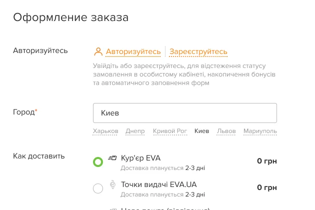
Before 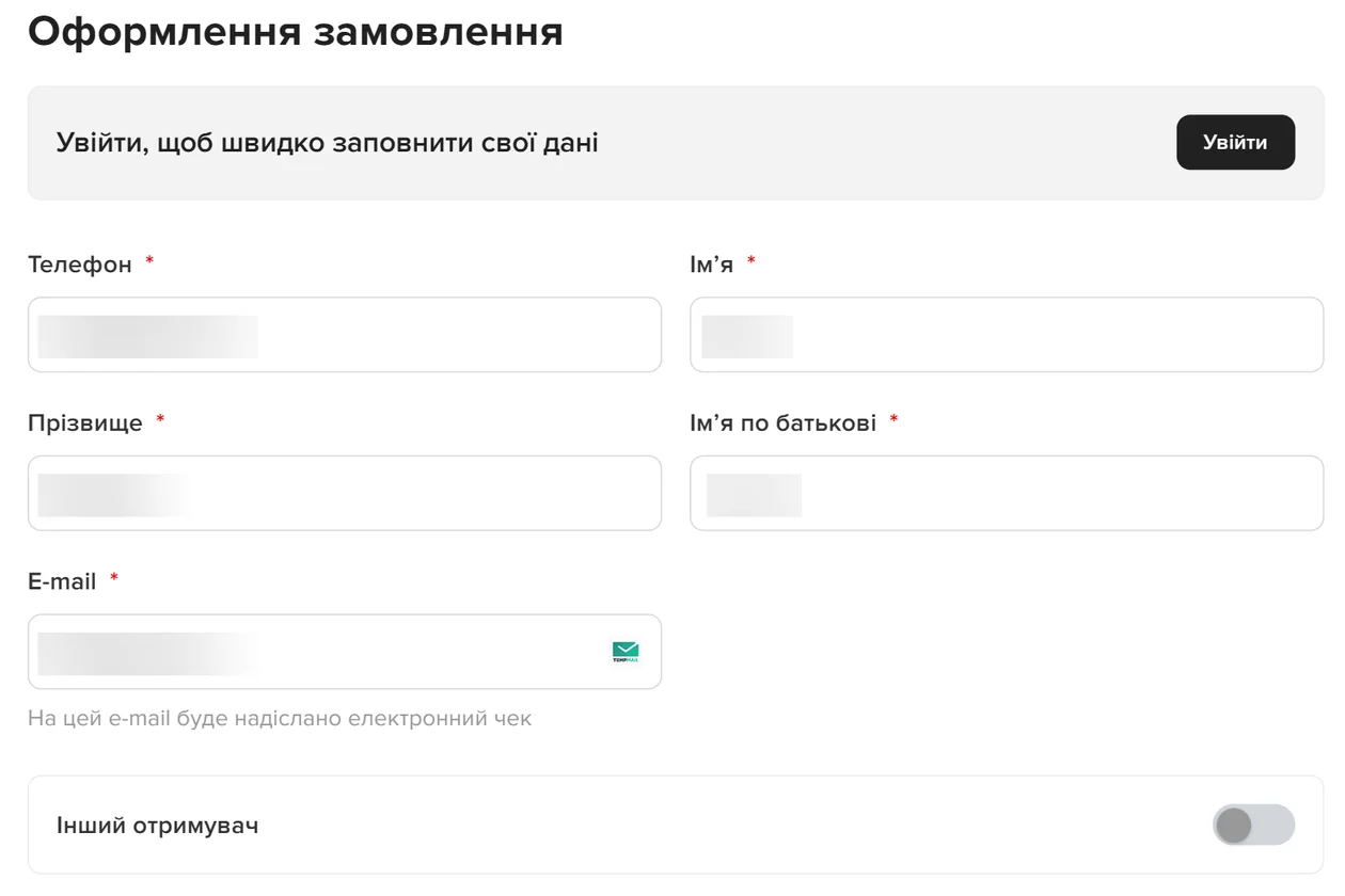
After -
Delivery opens on one suggestion
Before, every option was a row of the same weight. Now the block starts from the city, says when delivery is free, and opens on one option, a Nova Poshta parcel locker, with its price, an estimated delivery date and its hours.
One clear default with the date that matters, instead of six rows to compare.
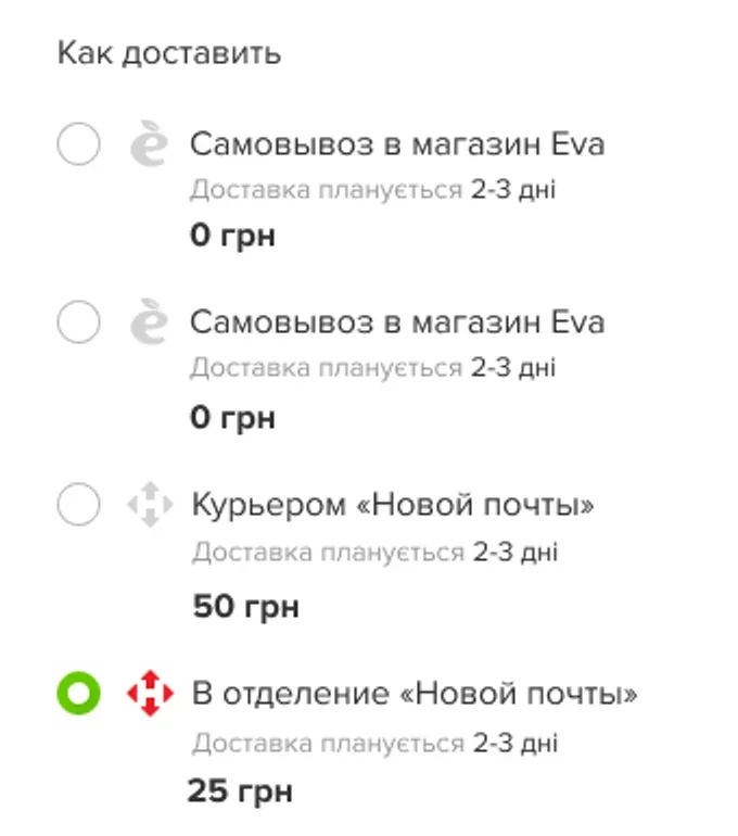
Before 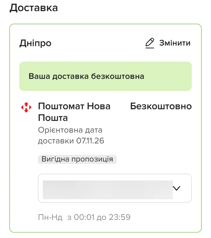
After -
The order button stays in reach on phones
Before, it sat in the summary at the end of the page. Now a dark “Place order” button with the total stays on screen through the form, with “We guarantee payment security” under it.
The total and the next step are in view at every field.
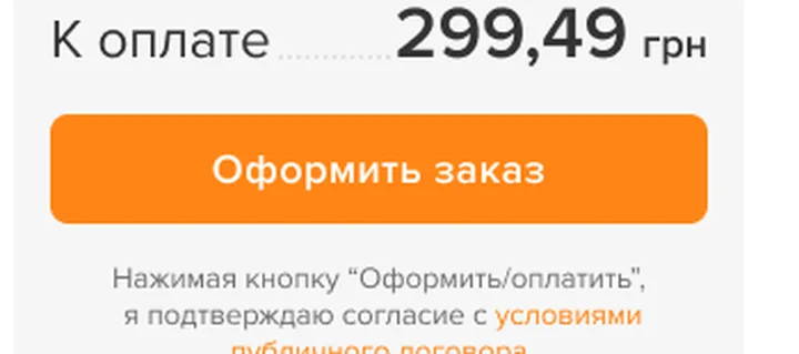
Before 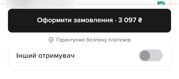
After
States
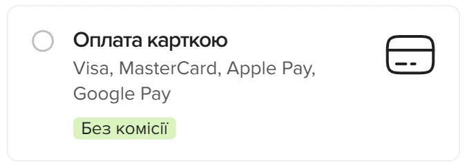
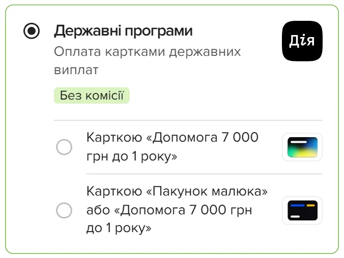
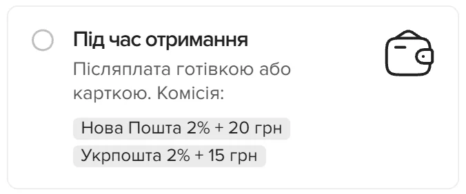
Every method says what it costs before you choose it: no commission for cards and instalments, each carrier’s fee for paying on receipt. State payment programmes are a method of their own, and the programmes that can’t be used are named above the list. The cards, tags and notices are EVA Library components.

How it was proved
- How it was read
- The funnel, block by block (begin, shipping, payment, purchase), to find the biggest losses.